series = list(
list(
data = c(29.9, 71.5, 106.4, 129.2, 144.0, 176.0, 135.6, 148.5, 216.4, 194.1, 95.6, 54.4)
)
)Thinking in highcharter - How to build any Highcharts plot in R
R
highcharter
Rstudio’s Mine Cetinkaya-Rundel had a post about the highcharter package, a wrapper for the Highcharts javascripts library that lets you create super sweet interactive charts in R.
Joshua Kunst’s highcharter package has become my go-to plotting package once I reach the production phase and know I will be using HTML. This is mainly for 3 reasons:
- Beautiful interactive charts
- Extremely customizable
- Great documentation (via Highcharts API). Requires understanding how a
highcharterobject is built and translating between the Highcharts the API.
ggplot2 is wonderfully customizable and the plotly wrapper can make interactive charts. I’m sure that plotly objects are customizable, as are other htmlwidget graphing packages, but I think Highcharts graphs are the most impressive. Hence, highcharter is where I have decided to dig deep.
As Mine noted, all products in this library are free for non-commercial use. If you plan to use highcharter in R for commericial use, please purchase Highcharts: https://shop.highsoft.com/
Also, a special thanks to Joshua Kunst for developing this package. I’ve learned a lot about R and javascript thanks to you. Y, gracias a ti mi amigo, siempre estaré empleado.
Goal of this Post
My goal is to show you how I think about, learn about, and then build more complicated highcharter objects in R. I want you to be able to see a graph on the Highcharts demo page and think to yourself, “yeah, I can build that”. This will means some bouncing between the Highcharts demo and API websites. I do this a lot myself and I hope, by the end of this document, you’ll find it a useful habit.
But I also want to say that my approach to building plots in highcharter can feel a bit complicated. Generally, I like to build plots from the ground up. However, if I have tidy data and I know the structure is well suited for plotting in highcharter, I will opt to use the hchart(). Otherwise, for almost anything more complicated, I will build the data structure (known as a “series”) from scratch and use the highchart() and hc_add_series_list() functions. This process is the result after having built many, many plots, hacking away at the great many functions in highcharter. While it may seem complicated, I assure you that it is the easiest and cleanest way to make complicated plots.
What I will not cover
- Straightforward, simple plotting using
highcharter. Mine’s post and Joshua Kunst’s online documentation are better resources for that. I will use simple examples, but as a stepping stone to more complicated plots and to learn how to “translate” Highcharts tohighcharter. - How to make Highstocks or Highmaps using
highcharter. That said, the way I go about building Highcharts plot will likely translate over to Highstocks and Highmaps, so this post may prove useful if you’re interested in making timeseries or map plots.
Prerequisites
This post assumes that you have a good handle of the tidyverse as well as basic object and list construction. In short, this is not a beginner’s tutorial but also not an advanced R tutorial.
Series: highcharter and Highcharts building blocks
Series are the building blocks of a Highcharts plot. Series contain the sets of data you want to plot. As a data scientist who wants to use highcharter to make spiffy plots, the key to building any plot in highcharter is understanding how to build a series in R and how it relates to the structure of a series in Highcharts.
I learn best by example. I will do the same in this document.
Series in highcharter are a list of lists with a specific structure
Think of any series you would like to plot in highcharter as a list of lists. The Highcharts equivalent is, at the very least, an array of with a single data object or, a its most complicated, an array of many objects and arrays.
Here is a simple Highcharts plot:
$(function () {
    Highcharts.chart('container', {
        series: [{
            data: [29.9, 71.5, 106.4, 129.2, 144.0, 176.0, 135.6, 148.5, 216.4, 194.1, 95.6, 54.4]
        }]
    });
});
Ignore everything but series. A series array (series: [ ]) with a single series object ({data: [ ] }) is the simplest Highcharts plot possible. Translated to R, a series would be a list with a single sublist with named elements. Note that “named elements” means I explicitly assign the elements of a list to a value i.e. unnamed elements list(c(1,2,3)) vs named list(x = c(1,2,3)). The named element in this case is data resulting in list structure list(data = c( )).
This series can be plotted using highchart() and hc_add_series_list()
library(highcharter)
library(tidyverse)

highchart() %>%
  hc_chart(backgroundColor = "white") %>%
  hc_add_series_list(series)
By default, highchart() assumes you are construction a Highcharts line chart. It also provides default series names (i.e. Series 1, Series 2 etc) and colors if these values are left unspecified.
Let’s change the series name and color to 'Hola linea' and 'red'. In Highcharts, the series array object would look like this:
$(function () {
    Highcharts.chart('container', {
        series: [{
            name: 'Hola linea',
            color: 'red',
            data: [29.9, 71.5, 106.4, 129.2, 144.0, 176.0, 135.6, 148.5, 216.4, 194.1, 95.6, 54.4]
        }]
    });
});
Translated to R, the series would be
series = list(
  list(
    name = 'Hola linea',
    color = 'red',
    data = c(29.9, 71.5, 106.4, 129.2, 144.0, 176.0, 135.6, 148.5, 216.4, 194.1, 95.6, 54.4)
  )
)
highchart() %>%
  hc_chart(backgroundColor = "white") %>%
  hc_add_series_list(series)
Let’s add a second series. The series array object now contains two series. Each series is an object (contain in { }, separated by ,) with named elements (aka “members”).
$(function () {
    Highcharts.chart('container', {
        series: [{
            name: 'Hola linea',
            color: 'red',
            data: [29.9, 71.5, 106.4, 129.2, 144.0, 176.0, 135.6, 148.5, 216.4, 194.1, 95.6, 54.4]
        },
        { // there's a comma between objects in { }
            name: 'Reverse!',
            color: 'green',
            data: [54.4, 95.6, 194.1, 216.4, 148.5, 135.6, 176, 144, 129.2, 106.4, 71.5, 29.9]
        }]
    });
});
And in R
series = list(
  list(
    name = 'Hola linea',
    color = 'red',
    data = c(29.9, 71.5, 106.4, 129.2, 144.0, 176.0, 135.6, 148.5, 216.4, 194.1, 95.6, 54.4)
  ),
  list(
    name = 'Reverse!',
    color = 'green',
    data = c(54.4, 95.6, 194.1, 216.4, 148.5, 135.6, 176, 144, 129.2, 106.4, 71.5, 29.9)
  )
)

highchart() %>%
  hc_chart(backgroundColor = "white") %>%
  hc_add_series_list(series)
Important: Naming matters. The Highcharts API for line series explicitly looks for object elements like
name,color,dataetc. Likewise, this means that the element names when building lists inRalso matter. Try changingdatatodatas(or anything else) and see that nothing will be plotted. Likewise, try changingnameto something else likenombres, and the series will fall back to the defaultSeries #.
hc_add_series_list() vs hc_add_series()
I prefer to always use hc_add_series_list(), even when only add a single series. Adding a single series can be done using hc_add_series(). For example, I could replicated the last plot by layering one series at a time.
highchart() %>%
  hc_chart(backgroundColor = "white") %>%
  hc_add_series(
    name = 'Hola linea',
    color = 'red',
    data = c(29.9, 71.5, 106.4, 129.2, 144.0, 176.0, 135.6, 148.5, 216.4, 194.1, 95.6, 54.4)
  ) %>%
  hc_add_series(
    name = 'Reverse!',
    color = 'green',
    data = c(54.4, 95.6, 194.1, 216.4, 148.5, 135.6, 176, 144, 129.2, 106.4, 71.5, 29.9)
  )
Notice that the construction of hc_add_series() is basically equivalent to how I built each list object in series that was then passed to hc_add_series_list(). I prefer, however, building list objects and saving them to a value (like series). This makes it easier to reuse the object and also makes for much shorter pipe chains when plotting.
Highcharts API and highcharter functions
Just throw an hc_ infront of it
Now that we’ve build a basic plot and have some understanding of what a series is, let’s play with some plot options!
The beauty of the highcharter package is that pratically every Highcharts API call can be quickly translated to highcharter without needing to look at highcharter documentation. Specifically, any Highcharts API options can be access by add hc_ infront of the function e.g. hc_xAxis() calls the xAxis API option, hc_tooltip() calls the tooltip API option, etc.
Here is what I mean. When you go to the Highcharts API Options Reference, there is a menu of list of “main” option calls to the left. It looks like this:
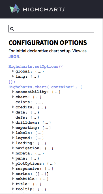
The highcharter equivalent to each “main” option can be accessed as a function by throwing an hc_ infront (chart becomes hc_chart(), plotOptions becomes hc_plotOptions() etc).
From there, accessing any “main” option value means using the exact same name as listed in the API. Any level deeper just means contructing a list() but the API reference names will always be the same.
Let’s work through an example by editing the x-axis looking only at the Highcharts API x-axis options.
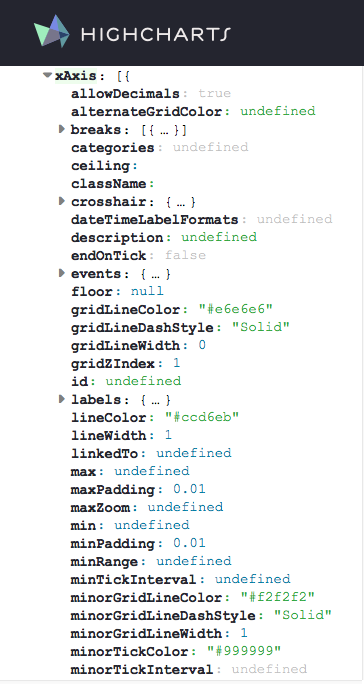
If I want to change the min, max, the line width, and some labeling quirks of the x-axis, then I just look at the API options for xAxis and locate the corresponding values.
In this case, three of these suboptions (min, max, lineWidth) are “unnested” level options, one is a “nested” level option (labels). What I call an “unnested” level suboption make up the majority of suboptions—any without { ... }, easily found by the little gray expansion triangle. “Unnested” suboptions can be accessed by using the unnested level API names asis plus a proper value. “Nested” level suboptions—those that are followed by {...} or just any {—require list(...) calls.
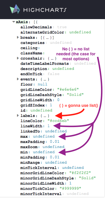
In the image above, examples of “unnested” level suboptions (i.e. suboptions with no {...}; access without a list) are in purple. One need only use the API name and provide a proper value. Examples of “nested” level suboptions (i.e. suboptions with { ... }; require biulding a list(...) object) are in red.
Knowing the “main” API option I want to use is xAxis, I can build the highcharter equivalent by throwing an hc_ infront. I can then directly call any of the “unnested” level suboptions min, max, and lineWidth since they are not nested { ... } objects. Using only the “unnested” level calls, the result would be hc_xAxis(min = 1, max = 7, lineWith = 5).
Note: As I said before, elements names must exactly match the API names, meaning suboptions are case-sensitive (i.e.
linewidth\(\ne\)lineWidth).
But what about nested level calls which require lists? The nested level call I cared about was labels. Expanding the API main option, the labels suboptions nests numerous more suboptions. One of them, style, is another nested suboption—the value starts with { .... Again—and hopefully you’re starting to see the pattern!—style suboption values can be accessed by building a named list().
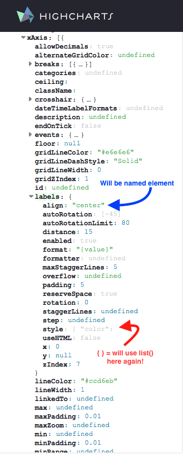
I choose two of the labels suboptions to change: align and style. align isn’t nested so I can just assign the proper value. The default is "center". I change it to "left": align = "left".
But style is another nested suboption (valuestarts with {). But again, not to worry, this just means another list(). I’ll change the font size, weight, and color style values: style = list(fontSize = "16px", fontWeight = "bold", color = "blue"). The nested fully constructed labels suboption is:
labels = list(align = "left",
              style = list(
                        fontSize = "16px",
                        fontWeight = "bold",
                        color = "blue"
                      ))
I can then add this labels as aother hc_xAxis() suboption:
hc_xAxis(min = 1,
         max = 7,
         lineWith = 5,
         labels = list(align = "left",
                       style = list(
                          fontSize = "16px",
                          fontWeight = "bold",
                          color = "blue"
                      )))
Throwing this all together, I can adjust the x-axis of the plot above by adding my fully constructed hc_xAxis function to the pipe chain.
highchart() %>%
  hc_chart(backgroundColor = "white") %>%
  hc_add_series_list(series) %>%
  hc_xAxis(min = 1,
         max = 7,
         lineWith = 5,
         labels = list(align = "left",
                       style = list(
                          fontSize = "16px",
                          fontWeight = "bold",
                          color = "blue"
                      )))
The corresponding code in Highcharts can be see here.
Use hchart() with Tidy Data
One of the most convinient function for plotting is the hchart() function. But I would only recommend the use of this function if one has a Tidy Dataframe structured in a “long” format with a time-key-value or key-value structure, similar to a dataframe that would be used in ggplot. I’ll show you what I mean.
Here is some code from an example in highcharter that builds a graph by extracting variables from citytemp and adding them as a series.
data(citytemp)
hc1 <- highchart() %>%
  hc_chart(backgroundColor = "white") %>%
  hc_xAxis(categories = citytemp$month) %>%
  hc_add_series(name = "Tokyo", data = citytemp$tokyo) %>%
  hc_add_series(name = "London", data = citytemp$london)
hc1
citytemp is in a “wide” format. But this data isn’t tidy. In these data, there are three variables: month, city, temperature. In this case, month is time, city is a key, and temperature is a value. I want to reshape the data such that each row of data is a single observation for the temprature of one city at one point in time. Reshaping the data to a “long” format with a tidy time-key-value structure will allow us to plot virtually the same plot but in one line using hchart().
citytemp2 <- citytemp %>%
  tidyr::gather(key = city, value = temperature, tokyo, london)
I can now use the hchart() function to plot these data. How the data splits into separate series is via the group variable in the hchart() function. Notice that the mapping of variables uses the function highcharter::hcaes(), which was inspired by the ggplot2 function ggplot2::aes() and has the same syntax.
hchart(citytemp2, type = 'line', hcaes(y = temperature, group = city, x = month)) %>%
 hc_chart(backgroundColor = "white")
If I just wanted to print data for tokyo and london, I can just filter the data prior to using hchart().
citytemp2 <- citytemp2 %>%
  dplyr::filter(city %in% c('tokyo', 'london')) # filter to just tokyo and london

hc2 <- hchart(citytemp2, type = 'line', hcaes(y = temperature, group = city, x = month))
hc2 %>%
 hc_chart(backgroundColor = "white")
NOTE: whatever is passed as the
xvariable must generally be of classDate,characterornumeric. Other types aren’t handled nicely, like classyearmonfrom thezoopackage. Often, the best strategy is to order the data, NOT pass axvariable, then label the x-axis later using thehc_xAxis(categories = some_vector_of_strings)option.
Your Best Friend, the hc$x$hc_opts$series List
Pretend you assigned your chart to the variable hc. You can extract the underlying series data used in the chart by digging into the lists hc$x$hc_opts$series. Referencing these series list is actually how I learned to finally start connecting the Highcharts API with tooltip options and series construction.
But this is where things also start to get tricky. How you pass data to highcharter or how you build a series affects the underlying structure of the data used for plotting. I will again show this by example.
Below, I build two charts with essentially the same output, hc1 and hc2. hc1 is built series by series, explicitly defining the series name and data (remember, the list names name and data are explicit, matching the API calls). hc2 is built series by passing a tidy dataframe to hchart, defining the x and y values but letting the series names be defined by the group variable.
# build series by series
hc1 <- highchart() %>%
  hc_chart(backgroundColor = "white") %>%
  hc_xAxis(categories = citytemp$month) %>%
  hc_add_series(name = "tokyo", data = citytemp$tokyo) %>%
  hc_add_series(name = "london", data = citytemp$london)
hc1
# build using hchart
citytemp2 <- citytemp %>%
tidyr::gather(key = city, value = temperature, tokyo, london)
hc2 <- hchart(citytemp2, type = 'line', hcaes(y = temperature, group = city, x = month))
hc2 %>%
hc_chart(backgroundColor = "white")So what? If the output is the same, what is there to fret about? Enter .$x$hc_opts$series.
Here is the underlying structure of the data used to make the hc1 plot.
length(hc1$x$hc_opts$series)#> [1] 2hc1$x$hc_opts$series # here is the series data and metadata#> [[1]]
#> [[1]]$data
#> [1] 7.0 6.9 9.5 14.5 18.2 21.5 25.2 26.5 23.3 18.3 13.9 9.6
#>
#> [[1]]$name
#> [1] "tokyo"
#>
#>
#> [[2]]
#> [[2]]$data
#> [1] 3.9 4.2 5.7 8.5 11.9 15.2 17.0 16.6 14.2 10.3 6.6 4.8
#>
#> [[2]]$name
#> [1] "london"hc1$x$hc_opts$series[[1]] # i can extract a specific series#> $data
#> [1] 7.0 6.9 9.5 14.5 18.2 21.5 25.2 26.5 23.3 18.3 13.9 9.6
#>
#> $name
#> [1] "tokyo"hc1$x$hc_opts$series[[1]]$data # also just the plotting data, which is a vector in this case#> [1] 7.0 6.9 9.5 14.5 18.2 21.5 25.2 26.5 23.3 18.3 13.9 9.6hc1$x$hc_opts$series is therefore a list of lists, where each element of the list .$series contains the plotting data. The structure of the data in this case is pretty simple and clean.
But now let’s look at hc2.
There series count is the same (2). But I’m not going to display the output of hc2$x$hc_opts$series because it is crazy long. However, I recommend running the code hc2$x$hc_opts$series yourself in the console and taking a look.
length(hc2$x$hc_opts$series)#> [1] 2# hc2$x$hc_opts$series # commented out because its so long
hc2$x$hc_opts$series[[2]][["name"]] # notice how we are extracting from the second series, "tokyo", not the first! Why is that? See the "Important Note" below.#> [1] "tokyo"hc2$x$hc_opts$series[[2]]$data %>% head(2) # extract the first 2 elements of the data for the tokyo series#> [[1]]
#> [[1]]$month
#> [1] "Jan"
#>
#> [[1]]$new_york
#> [1] -0.2
#>
#> [[1]]$berlin
#> [1] -0.9
#>
#> [[1]]$city
#> [1] "tokyo"
#>
#> [[1]]$temperature
#> [1] 7
#>
#> [[1]]$y
#> [1] 7
#>
#> [[1]]$name
#> [1] "Jan"
#>
#>
#> [[2]]
#> [[2]]$month
#> [1] "Feb"
#>
#> [[2]]$new_york
#> [1] 0.8
#>
#> [[2]]$berlin
#> [1] 0.6
#>
#> [[2]]$city
#> [1] "tokyo"
#>
#> [[2]]$temperature
#> [1] 6.9
#>
#> [[2]]$y
#> [1] 6.9
#>
#> [[2]]$name
#> [1] "Feb"IMPORTANT NOTE: Why is the
tokyodata the second series inhc2, which usedhchart, but the first series inhc1? This is because, when you build the chart series by series (usinghc_add_series), the index follows the order of inclusion. Thetokyodata is added tohc1chart first, so it becomes the first series (.$series[[1]]). On the other hand, if you usehchart, then highcharter orders series alphabetically.londoncomes beforetokyo, sotokyois the second series (.$series[[2]]). Given that the order of how a series is plotted can matter, this is a very important caveat to remember when usinghchart!
The fact that hc2$x$hc_opts$series is so much longer than the very concise hc1$x$hc_opts$series is telling you that hchart is a very different beast than building using hc_add_series or hc_add_series_list. Yet, despite having very different underlying series structures, each produces the same visual output.
What’s going on? Why is the structure so different?
Let’s dive deeper by looking at the first element of the data list for the tokyo series in hc1 and hc2. Remember, the tokyo data is the first series in hc1 and the second in hc2.
# first data element of tokyo series
hc1$x$hc_opts$series[[1]]$data[[1]] # first series here (ordered by how series was added)
#> [1] 7hc2$x$hc_opts$series[[2]]$data[[1]] # but second series here (ordered alphabetically by series name)#> $month
#> [1] "Jan"
#>
#> $new_york
#> [1] -0.2
#>
#> $berlin
#> [1] -0.9
#>
#> $city
#> [1] "tokyo"
#>
#> $temperature
#> [1] 7
#>
#> $y
#> [1] 7
#>
#> $name
#> [1] "Jan"For reference, here, again, is that code that generated hc1 and hc2. I also recommend looking at the structure of the citytemp and citytemp2 data objects to refresh yourself.
hc1 <- highchart() %>%
  hc_chart(backgroundColor = "white") %>%
  hc_xAxis(categories = citytemp$month) %>%
  hc_add_series(name = "tokyo", data = citytemp$tokyo) %>%
  hc_add_series(name = "london", data = citytemp$london)

hc2 <- hchart(citytemp2, type = 'line', hcaes(y = temperature, group = city, x = month))
The value of hc1$x$hc_opts$series[[1]]$data[[1]] is 7. This maps directly with citytemp$tokyo[1]. This is because the data for each series in hc1 is a single vector (or array) of data (..., data = citytemp$tokyo)). A nice chart is still generated because the API handles the translation of the 1d data vector to y values and creates the corresponding x index values.
But the value of hc2$x$hc_opts$series[[2]]$data[[1]] is a list of 5 named elements.
hc2$x$hc_opts$series[[2]]$data[[1]] %>% str()#> List of 7
#> $ month : chr "Jan"
#> $ new_york : num -0.2
#> $ berlin : num -0.9
#> $ city : chr "tokyo"
#> $ temperature: num 7
#> $ y : num 7
#> $ name : chr "Jan"The best way to think of element hc2$x$hc_opts$series[[2]]$data[[1]] is as a point with, in this case, 5 bits of data. While each bit of data exists as part of the point, not all of the data is used when creating the chart. The only bits of data used are those that have names used by the Highcharts API, like y and name.
There are a few things to notice, each rooted in the code hchart(., type = 'line', hcaes(y = temperature, group = city, x = month)):
- The dataframe
citytemp2had only 3 variables (month,city,temperature).hchartnot only passes these variables as data, it then passes the variables assigned to theyandxarguments (y = temperature,x = month). - But wait, there is no
xnamed element? The variable assigned toxwas renamed toname, *which is not to be confused with the series namehc2$x$hc_opts$series[[2]]$name. This is because the variable assigned toxwas of classcharacter. Highcharts cannot chart a non-numeric value to the x-axis. Instead,highcharterautomatically maps string values assigned toxto the list elementname. Index values are then generated forxby the API and each is labeled by thenamevalue.
One-dimensional array? Easy! Multi-dimensional arrays? Damn.
Turns out that Highcharts, by default, parses the contents of the data array object element by element, looking for sub-arrays with specific names (y, x etc) or a specific order ([2, 5] order implies x = 2, y = 5).
If Highcharts finds a single unlabeled data array instead of an array with subarray elements (essentially a one-dimensional vector vs a list of lists), it assumes that the data maps to y and creates an index for each value to act as the x-axis. That is, in the background, the API takes the single 1-dim array, assumes its the data for y, and then creates (x, y) array pairs where x is just an index 1:length(y).
Things start getting cumbersome and confusing the moment you want to chart anything more complicated than a one-dimensional vector/array—like specific (x,y) data pairs or perhaps extra data to label specific points or to make fancy tooltips. In R terms, this means that data goes from being a simple vector to a sprawling list of sublists where each element of data (e.g. data[[1]]) is actually another named list.
The pros of this is you have total control over what you want to plot! The downside is that a simple change to a chart can sometimes be incredibly tedious.
If you just want a plot with no special customizations, no problem! Easy, clean, straightforward. But the moment you want to customize even one point in a series, the amount and complexity of code you have to write just ballooned 2 or 3 fold.
My next post will cover how to deal with these more complex plots. It can be tedious but the results are beautiful. As I told my old boss, “It is amazing how much you have to code to make there be less in a plot.”